The Psychology of Color: Evoking Emotions in Art

Understanding Color Psychology and Its Importance
Color psychology is the study of how colors affect human behavior and emotions. It's fascinating to realize that different colors can evoke distinct feelings—like how blue can create a sense of calm, while red may ignite passion or urgency. This interplay between color and emotion plays a crucial role in art, as artists often choose their palettes with intention to provoke specific responses from viewers.
Color is the keyboard, the eyes are the harmonies, the soul is the piano with many strings.
For example, think about how you feel when you see a bright yellow canvas compared to a deep, moody black one. The former might uplift your spirits, while the latter could evoke feelings of sadness or introspection. By understanding these effects, artists can effectively communicate their messages and engage their audience on a deeper level.
Related Resource
In a world saturated with visual stimuli, the strategic use of color can help a piece of art stand out, making the emotional experience more profound. When artists harness the power of color, they tap into a universal language that transcends words, allowing viewers to connect with their work in a visceral way.
The Emotional Impact of Warm Colors in Art
Warm colors—think reds, oranges, and yellows—are known for their stimulating and energizing effects. These hues can evoke feelings of warmth, excitement, and even aggression, making them powerful tools in an artist's arsenal. For instance, in a painting depicting a fiery sunset, the warm colors can create an atmosphere filled with passion and intensity, drawing the viewer into the moment.
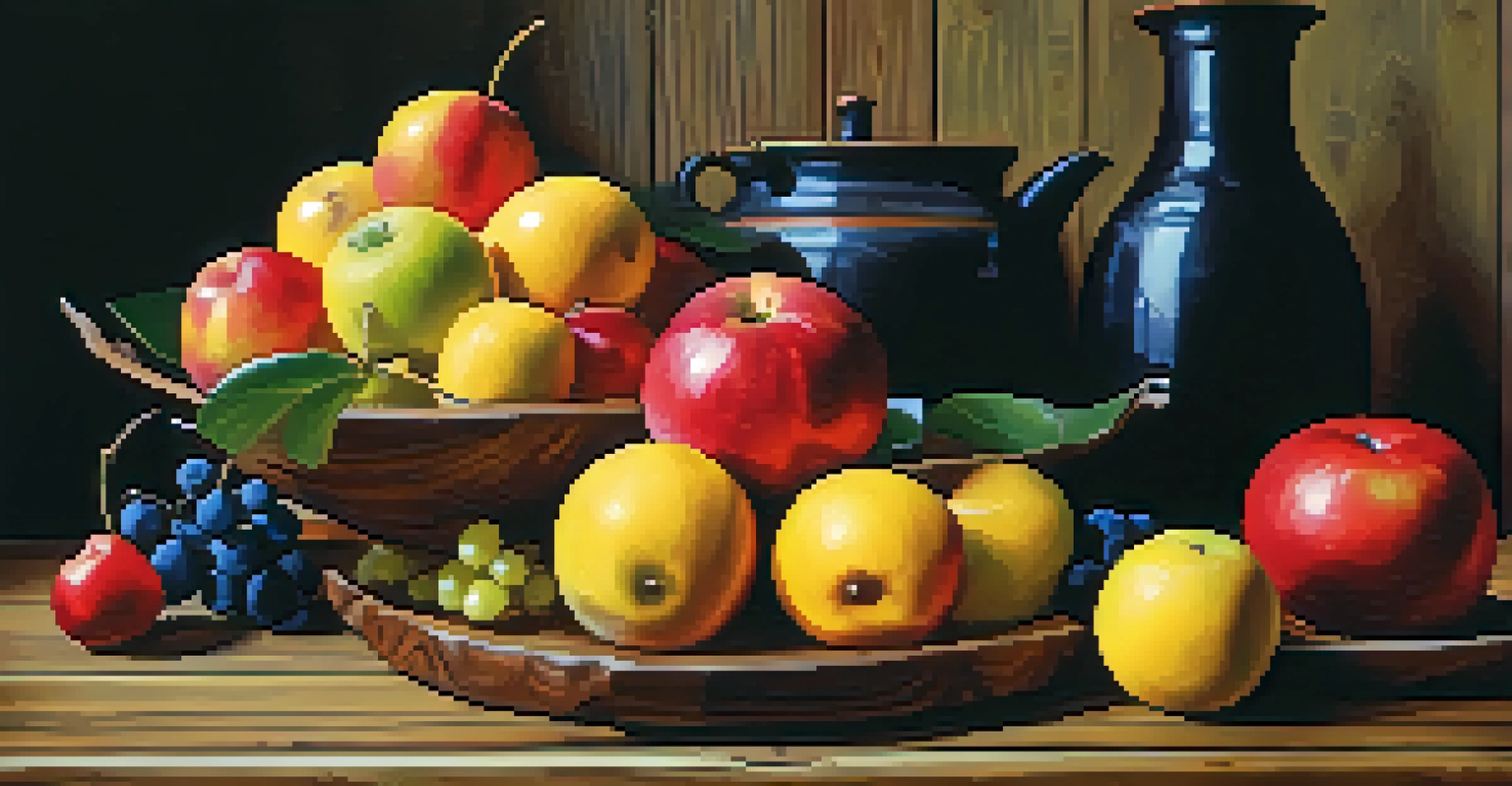
Artists often use warm colors to create a sense of immediacy and action. Imagine a vibrant red apple in a still-life painting; it doesn’t just sit there—it practically leaps off the canvas, inviting you to reach out and grab it. This ability to evoke visceral reactions can transform a simple image into an emotionally charged experience.
Colors Influence Emotions
Different colors evoke specific feelings, such as blue inducing calmness and red sparking passion.
However, it's essential to balance warm colors with cooler tones to avoid overwhelming the viewer. A strategically placed blue or green can help ground the composition, allowing the warm hues to shine without becoming too chaotic. This interplay is what makes the emotional experience of art so nuanced and impactful.
The Soothing Effects of Cool Colors in Art
Cool colors like blues, greens, and purples are often associated with calmness and tranquility. These shades can evoke feelings of peace and relaxation, making them ideal for artworks meant to soothe the soul. For example, a serene landscape painting featuring soft blues and greens can transport viewers to a place of calm, helping them escape the chaos of daily life.
Colors, like features, follow the changes of the emotions.
Artists strategically use cool colors to create depth and distance in their works. A misty blue mountain range can recede into the background, enhancing the sense of space and inviting the viewer to explore the scene. This technique not only adds dimension but also contributes to the emotional narrative of the artwork.
Related Resource
The psychological effects of cool colors can also be beneficial for audiences seeking solace or reflection. Many people might find themselves gravitating toward peaceful blues during times of stress, illustrating how color can play a role in our emotional well-being. By incorporating these hues into their art, creators can foster a sense of connection and healing.
Color Symbolism and Its Role in Artistic Expression
Different colors carry various meanings and symbolism across cultures, adding another layer to the emotional experience of art. For instance, white is often associated with purity and innocence in Western cultures, while in some Eastern traditions, it symbolizes mourning. Artists who are aware of these associations can use color to convey specific messages that resonate with their audience.
Take the color green, for example. In many cultures, it symbolizes growth, renewal, and even prosperity. An artist might use vibrant greens in a piece about nature's rebirth, effectively communicating themes of hope and rejuvenation. This type of color symbolism allows for deeper engagement with the art, as viewers interpret the piece through their own cultural lenses.
Cultural Context Matters
Color perception varies across cultures, affecting how audiences emotionally connect with art.
By embedding symbolism into their use of color, artists can enhance the narrative quality of their work. This not only enriches the viewer's experience but also opens up avenues for dialogue about the art and its meaning. Ultimately, the interplay between color and symbolism creates a multifaceted emotional landscape in art.
The Influence of Cultural Context on Color Perception
Cultural context plays a significant role in how colors are perceived and the emotions they evoke. For instance, while red may symbolize love and passion in many Western cultures, it can signify danger or warning in others. This variability highlights the importance of understanding the audience when creating art, as the emotional impact of color can differ dramatically based on cultural backgrounds.
Artists who are mindful of these cultural nuances can create work that resonates more deeply with diverse audiences. Consider an artist using bold oranges and yellows to celebrate a festival in one culture; the colors may evoke joy and festivity, while in another context, they could have entirely different connotations. This awareness can enrich the viewer's experience and foster a greater appreciation of the artwork.
Related Resource
Moreover, as the world becomes increasingly globalized, artists have the opportunity to blend various cultural influences in their color choices. This not only broadens the emotional appeal of their work but also invites viewers to explore and reflect on the different meanings behind the colors used. In this way, color in art becomes a bridge connecting diverse perspectives and emotions.
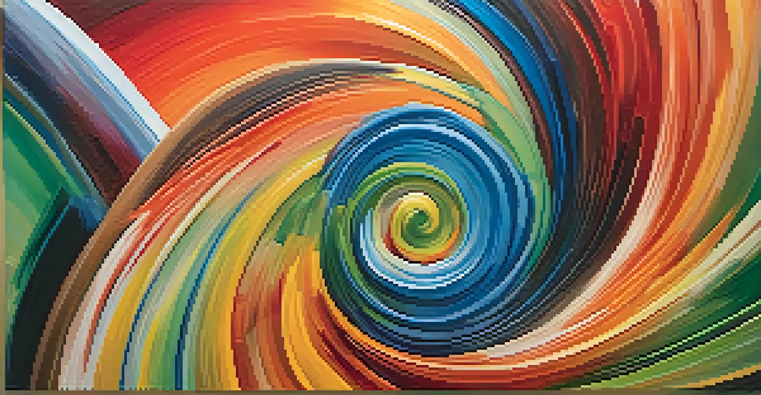
Color Theory: How Artists Choose Their Palettes
Color theory is a fundamental concept that artists rely on to create harmonious and emotionally resonant works. It encompasses the relationships between colors and how they interact with each other. For instance, complementary colors, which are opposite each other on the color wheel, can create dynamic tension and vibrancy when used together, enhancing the emotional impact of the piece.
Artists often experiment with different palettes to evoke specific feelings. A monochromatic palette, using variations of a single color, can create a sense of unity and calm, while a vibrant mix of colors can generate excitement and energy. This thoughtful approach to color selection is what allows artists to express their emotions and intentions effectively.
Color Theory Enhances Art
Understanding color theory empowers artists to create emotionally resonant works through intentional palette choices.
Understanding color theory not only empowers artists but also enriches the viewing experience for audiences. When viewers recognize the intentional use of color in a piece, it deepens their connection to the artwork and enhances their emotional response. This synergy between artist and audience is what makes art such a powerful form of expression.
The Future of Color in Art and Emotional Expression
As technology advances, the way we perceive and use color in art is evolving. Digital art, for instance, allows for an expanded color palette and new methods of blending hues that can elicit even more complex emotional responses. This shift opens up exciting possibilities for artists to experiment with color in ways that were previously unimaginable, pushing the boundaries of emotional expression.
Moreover, the growing awareness of color psychology is inspiring artists to become even more intentional in their color choices. With a deeper understanding of how colors affect human emotions, creators are now equipped to craft experiences that resonate on a more profound level. This awareness can lead to art that not only captivates visually but also heals and uplifts.
Looking ahead, we can expect to see continued exploration of color in art, blending traditional techniques with modern innovations. As artists harness the power of color to evoke emotions, they will undoubtedly continue to inspire audiences to reflect on their feelings and experiences, making art a vital part of our emotional landscape.