The Impact of Color Theory on Art Appreciation and Analysis

Understanding the Basics of Color Theory in Art
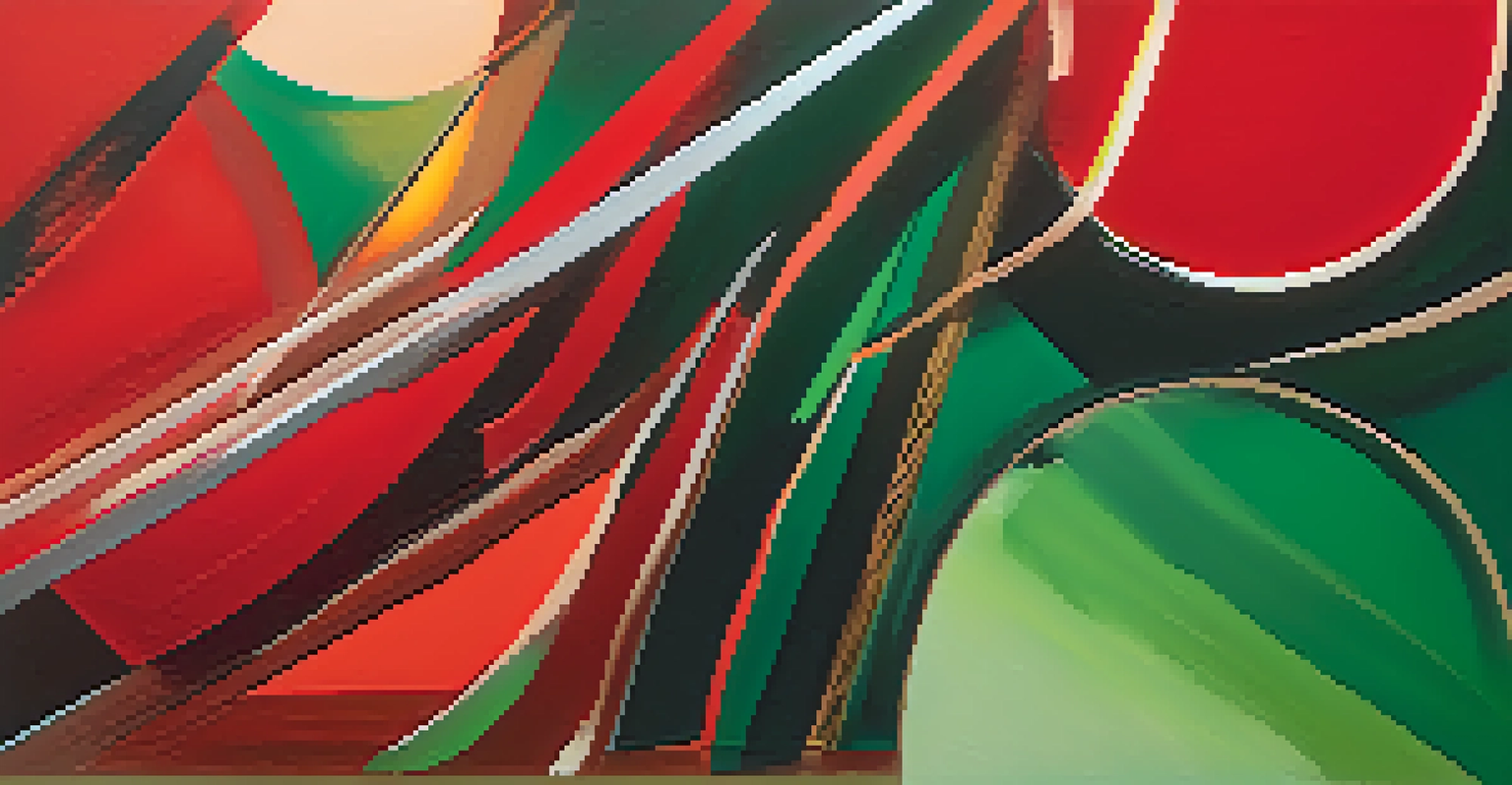
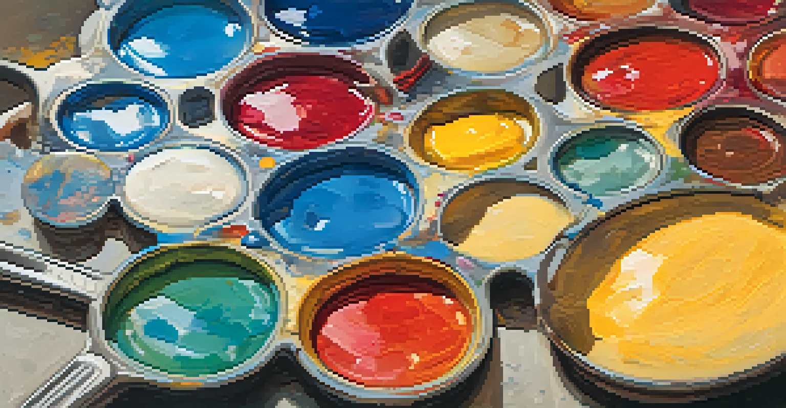
Color theory is a foundational concept in art that explains how colors interact with each other. It encompasses the color wheel, color harmony, and the emotional impact of colors. Artists use these principles to create visually appealing compositions that evoke specific feelings or ideas.
Color is the keyboard, the eyes are the harmonies, the soul is the piano with many strings.
At its core, color theory helps artists and viewers alike to understand the significance of color choices. For example, a painting dominated by warm colors like reds and yellows may evoke feelings of warmth and energy, while cool colors like blues and greens can create a sense of calm and tranquility. This understanding can deepen one’s appreciation for the art.
Related Resource
As we explore color theory, we can see how it serves as a tool for both artistic expression and viewer interpretation. It encourages us to look beyond the surface and consider why an artist made specific color choices, ultimately enriching our overall experience of the artwork.
The Emotional Impact of Colors in Art
Colors have the power to evoke emotions, and artists skillfully leverage this in their work. For instance, red can symbolize passion or anger, while blue often conveys sadness or serenity. This emotional connection can significantly enhance our appreciation of a piece of art, making it more relatable and impactful.
Consider a landscape painting where the artist uses a vibrant sunset filled with oranges and pinks. This choice can stir feelings of nostalgia or hope, allowing viewers to connect with their personal experiences. By understanding the emotional implications of colors, we can better appreciate the artist's intent and the narrative behind the work.
Color Theory Basics Unveiled
Color theory explains how colors interact and their emotional impact, enriching our understanding of artistic choices.
Moreover, the psychological effects of colors can vary across cultures, adding another layer of complexity to art interpretation. By recognizing these differences, we can cultivate a more nuanced understanding of how color shapes our emotional responses to art, leading to a richer appreciation.
Color Harmony: Creating Balance in Art
Color harmony refers to the pleasing arrangement of colors in an artwork. Artists use various techniques, such as complementary, analogous, or triadic color schemes, to achieve balance and visual interest. This harmony is crucial because it guides the viewer’s eye and creates a cohesive experience.
Colors, like features, follow the changes of the emotions.
For example, a painting that employs complementary colors—opposites on the color wheel—can create a dynamic tension that draws attention. This technique not only enhances the visual appeal but also adds depth to the artwork, encouraging viewers to engage more deeply.
Related Resource
Understanding color harmony allows art lovers to recognize the skill involved in a piece's composition. It transforms the viewing experience from passive observation to active analysis, making us appreciate the artist's thoughtful approach to color usage.
The Role of Color Context in Art Analysis
The context in which colors are used can dramatically alter their meaning and impact. For instance, a color might evoke a certain emotion in one artwork while conveying a completely different message in another. This variance highlights the importance of considering the surrounding elements when analyzing art.
An artist’s choice of color can also reflect cultural, historical, or personal significance. For example, the use of green may symbolize growth in one context, while in another, it could represent envy. Being aware of these nuances enriches our understanding and appreciation of the artwork.
Emotional Power of Colors
Colors evoke strong emotions, and understanding their psychological effects enhances our appreciation of art.
By examining color context, we become more adept at deciphering the layers of meaning within a piece. This deeper analysis encourages a more thoughtful engagement with art, allowing us to appreciate the complexity of the artist's message.
The Influence of Light on Color Perception
Light plays a crucial role in how we perceive color, affecting everything from vibrancy to mood. Artists must consider the source and quality of light when creating their work, as it can significantly alter the appearance of colors. For instance, a painting viewed under natural light may appear different than one viewed under artificial light.
This interplay between light and color is vital for art appreciation. It encourages us to consider how different lighting conditions might change our experience of a work. By recognizing this, we can develop a more comprehensive understanding of the artist’s intentions.
Related Resource
Moreover, understanding light's influence equips us to look at art more critically. We can ask ourselves how light interacts with color in the piece and what effect that might have on our emotional response, making our appreciation more informed and engaged.
Interpreting Symbolism Through Color in Art
Colors often carry symbolic meanings that can enhance the narrative of an artwork. Artists frequently use specific hues to convey themes or ideas, such as using white to symbolize purity or black for mourning. Recognizing these symbols allows us to appreciate the deeper meanings embedded in the artwork.
For instance, in many cultures, the color red can symbolize love, power, or danger. An artist might choose red intentionally to evoke a specific reaction or to highlight a critical aspect of the narrative. By interpreting these color choices, we can unlock layers of meaning that may not be immediately apparent.
Historical Evolution of Color Use
The evolution of color theory throughout art history reflects changing artistic movements and cultural contexts.
Understanding color symbolism encourages us to engage with art on a more intellectual level. It promotes critical thinking and fosters a connection between the viewer and the artwork, making our appreciation richer and more profound.
The Evolution of Color Theory in Art History
Color theory has evolved significantly throughout art history, reflecting changes in artistic movements and cultural contexts. From the vibrant palettes of Impressionism to the bold colors of Expressionism, each era has its unique approach to color. This evolution showcases how artists have continually experimented with color to express their ideas.
Understanding this historical context can enhance our appreciation for contemporary artists who might draw inspiration from past theories. For example, modern artists might blend traditional color theories with innovative techniques, creating works that challenge our perceptions.
By exploring the evolution of color theory, we gain insights into how art reflects broader cultural shifts. This awareness allows us to appreciate the ongoing dialogue between color and artistic expression, enriching our understanding of art as a dynamic and evolving form.